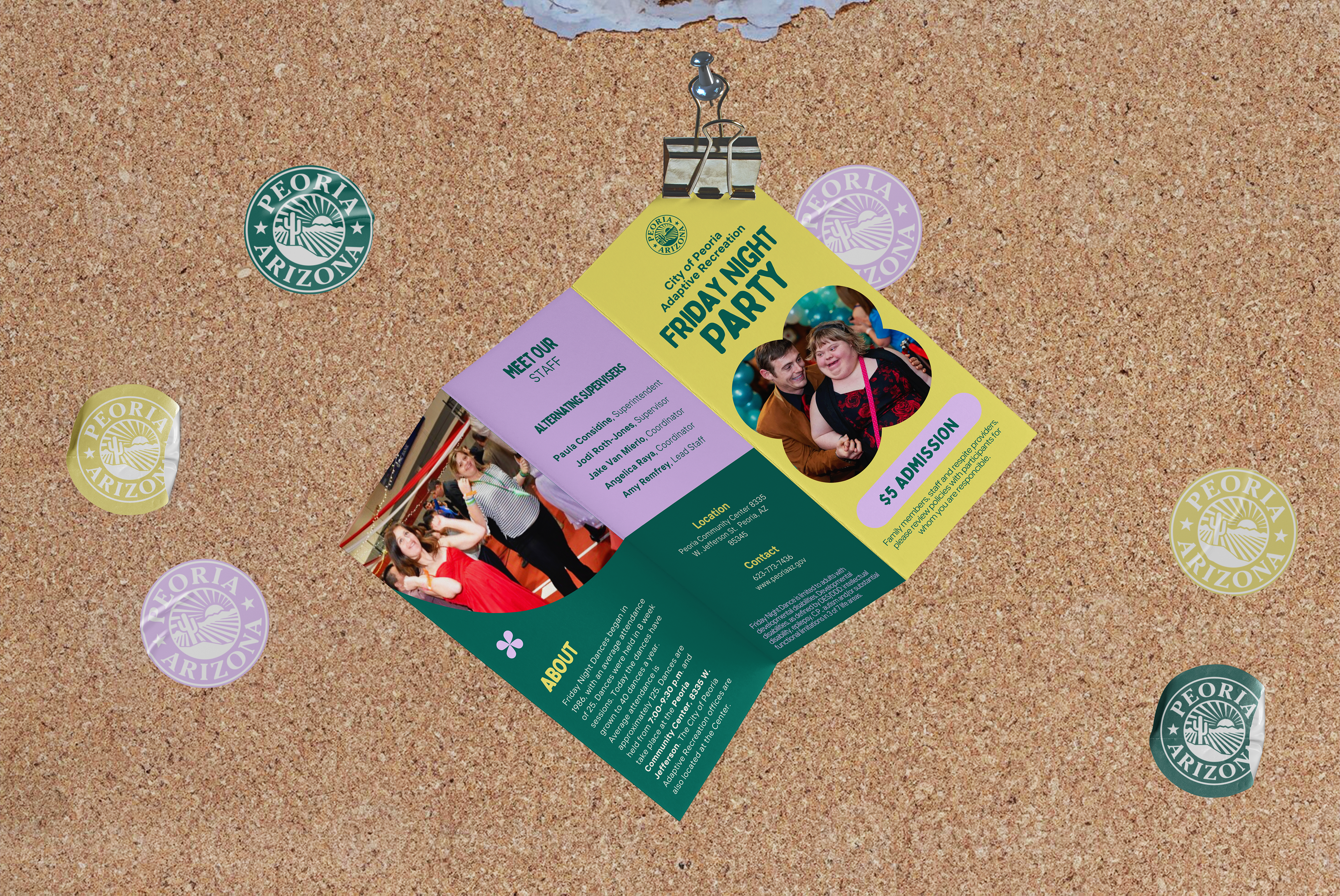
Friday Night Dance Brochure
Layout & Composition, Text Hierarchy, Color Harmony
Overview
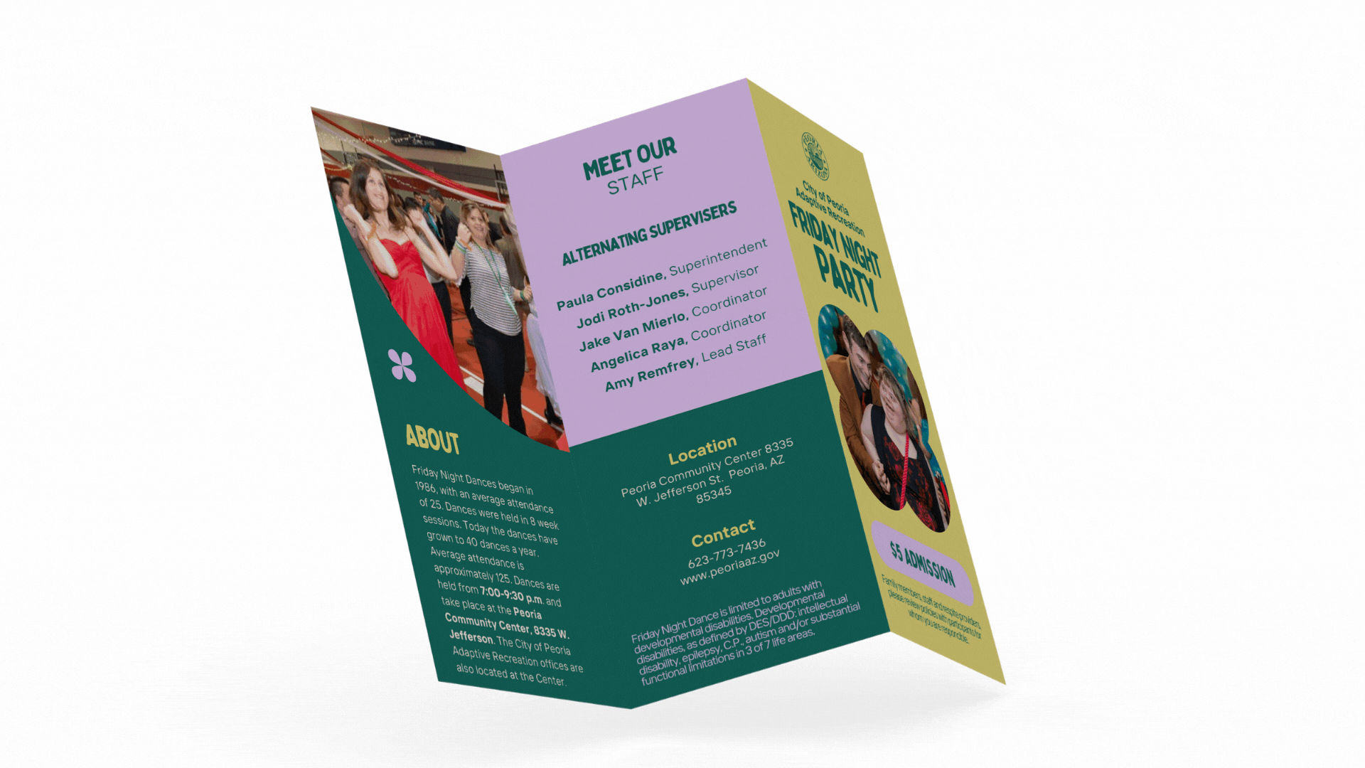
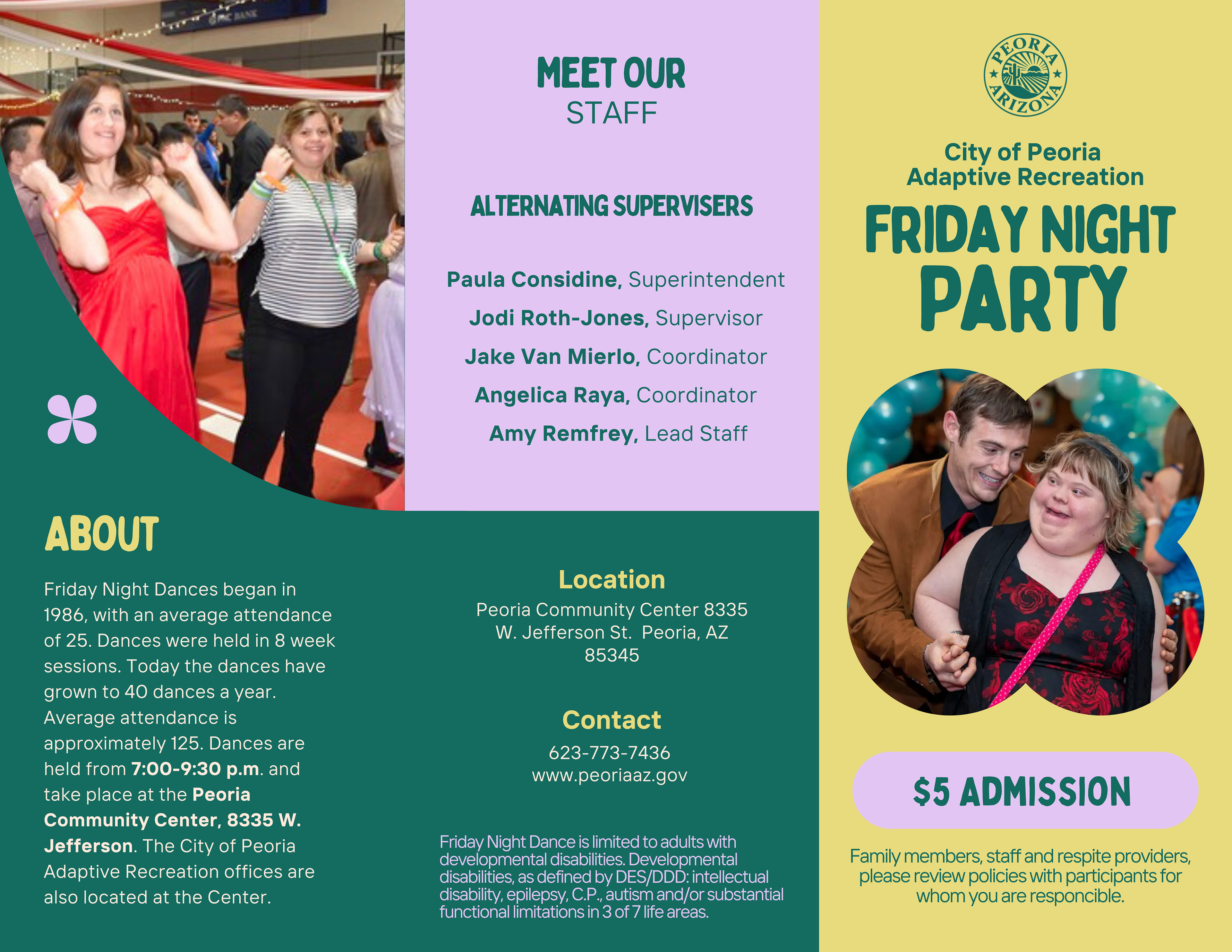
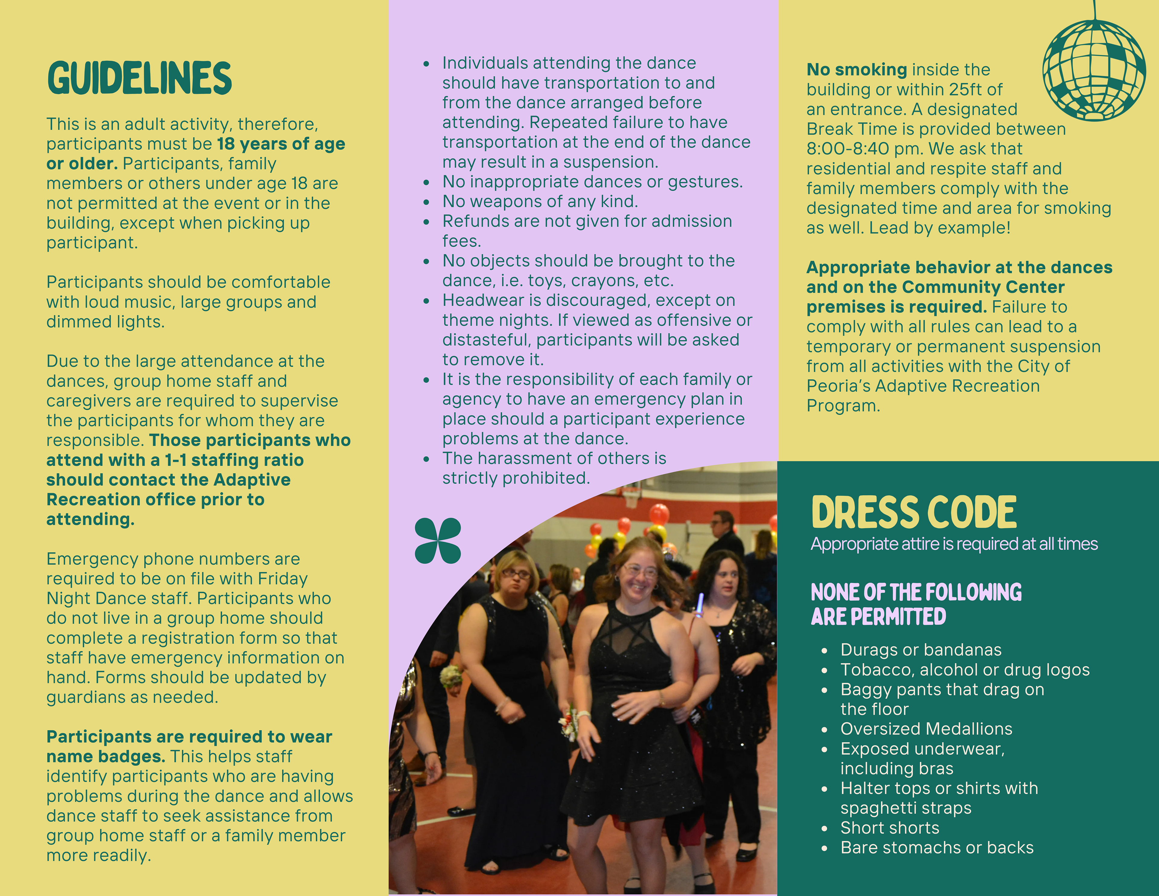
The City of Peoria Adaptive Recreation Program hosts a recurring Friday Night Dance for adults with developmental disabilities. I was tasked with creating a tri-fold brochure with essential event details — including the event history, guidelines, dress code, staff list, and contact information. The goal was to create a piece that felt fun, welcoming, and inclusive while still being organized and easy to read.
Problem
One of the main challenges of this project was the amount of content that needed to be included. With multiple lists, long guidelines, and background information, it was easy for the design to become cluttered and overwhelming.
Key issues I faced:
- Fitting large amounts of text into limited panel space
- Maintaining readability while using small font sizes
- Avoiding visual clutter that could overwhelm the audience
Solution
To solve these challenges, I focused on clarity, hierarchy, and visual separation.
Color Blocking: Each section was placed on its own colored panel to clearly separate content and prevent crowding.
Text Hierarchy: Large, bold headings direct attention, while bold keywords in the body text highlight essentials.
Balanced Layout: Photos of participants bring warmth and energy, breaking up dense text sections.
Friendly Typography: Rounded, approachable fonts keep the tone welcoming, while high contrast colors ensure readability.